eXperience HOTELS

experience hotels images

This is a project that I undertook as part of the UX Design diploma at the UX Design Institute, a case study of a Hotel Booking app.

In this project I carried out the whole UX design process, from scratch. I began with the research phase and ended all the way up to designing and testing a prototype.

My goal was to create an app that is easy to use, and tries to solve the problems that users face when booking a hotel through their mobile phones.

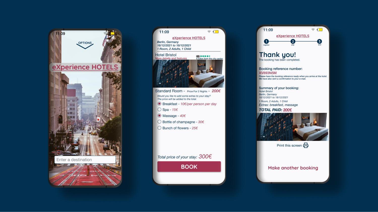
Take a look at the finished prototype.

To undertake this case study I followed the UX Process all the way from research to validation. Click to access each section:

UX Process

Research phase

I began this project researching the field of Hotel apps, to collect raw quantitative and qualitative data about the apps. I used triangulation to pinpoint common occurrences, in the different research methods, of problems that users were facing, or good practices and conventions that need to be continued.

Methods used for research:

Competitive Benchmark

Objectives:
  • Learn how Hotel Search apps solve the problems that users may find.
  • Identify the conventions of this industry and best practice that we should emulate.

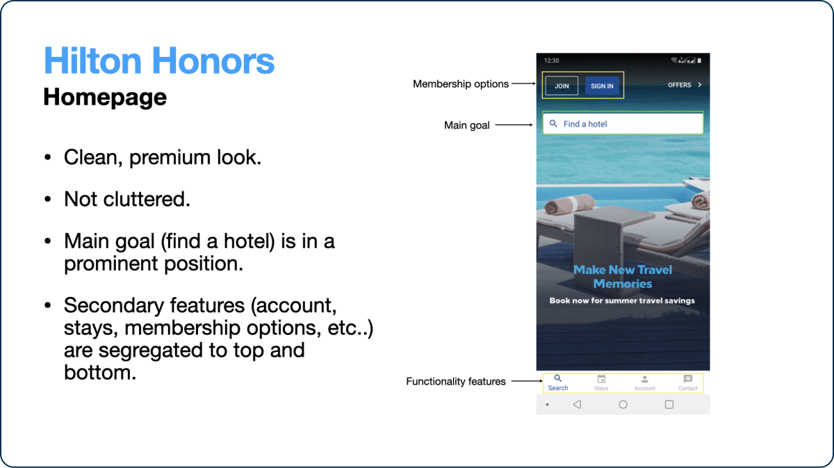
For my first research project I chose 4 Hotel Search apps of well-known brands to benmarch against. In order to have a better understanding of the common issues and best practices of this particular field, I decided to choose a variety of brands: 2 "premium" brands, one "budget" brand and a travel search app:

  • Hilton Honors
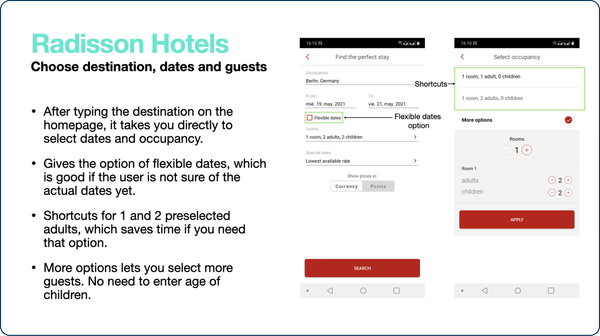
  • Radisson Hotels
  • Best Western
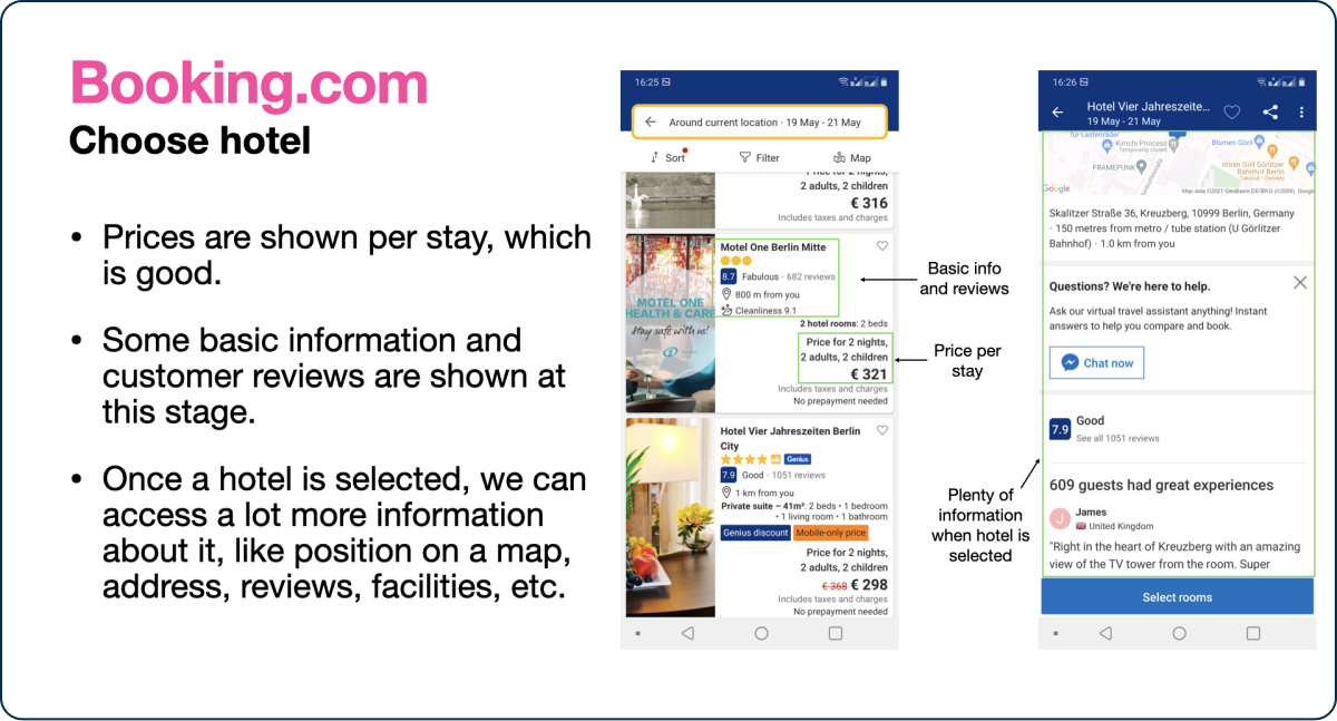
  • Booking.com

Best practices, conventions and pain points were identified at the different stages of the user flow, and color coded for an easier analysis on the final document.

These are some of the findings that I gathered:

  • Some brands show “price per stay”, which is preferable to “price per night”.
  • Some show Tripadvisor reviews for the different hotels.
  • Because of the lack of space on mobile phones, some apps have problems displaying hotel details and other information.
  • Sometimes the prices are shown in a currency different from the user's, which is not optimal.

Take a look at the finished document here.

User Survey

Objectives:
  • Gather both quantitative and qualitative data from a group of users.
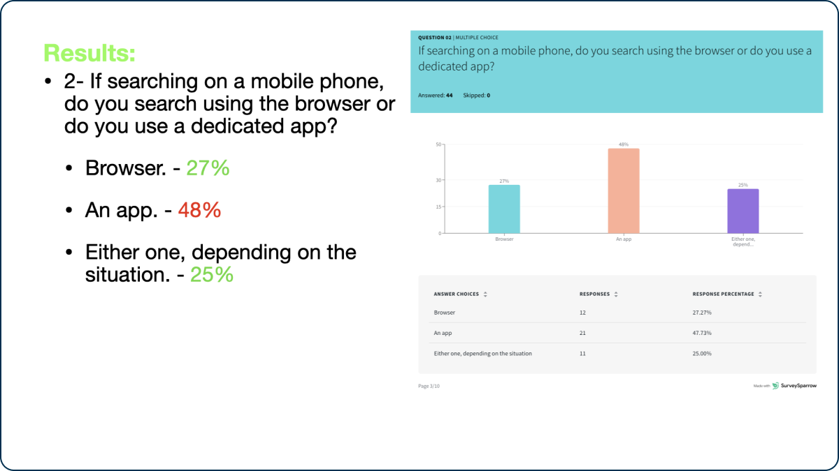
  • Learn more about the goals and methods in which people usually use Hotel Apps.

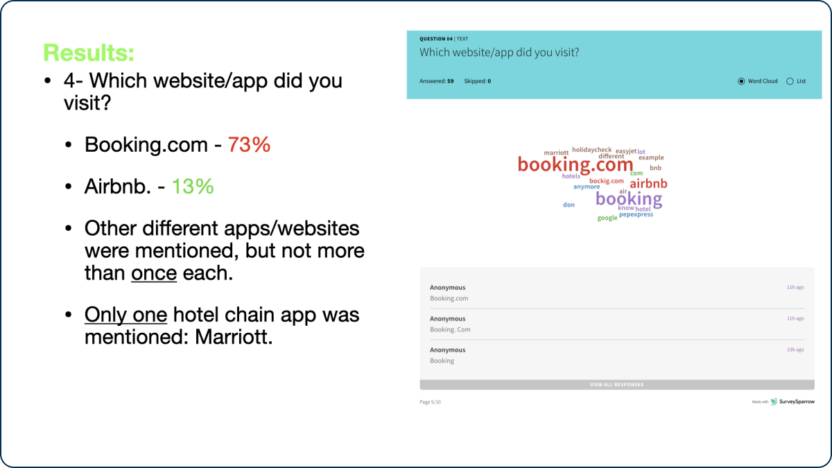
For this project I had to learn how to create an online survey to gather both quantitative and qualitative data from real users. I used Survey Sparrow to create the survey and I passed it to my work colleages. In the end I managed to get 64 users to complete the survey, gathering a considerable amount of data.

The results were first exported as a spreadsheet and then edited on a separate document for better review.

Some interesting findings and comments:

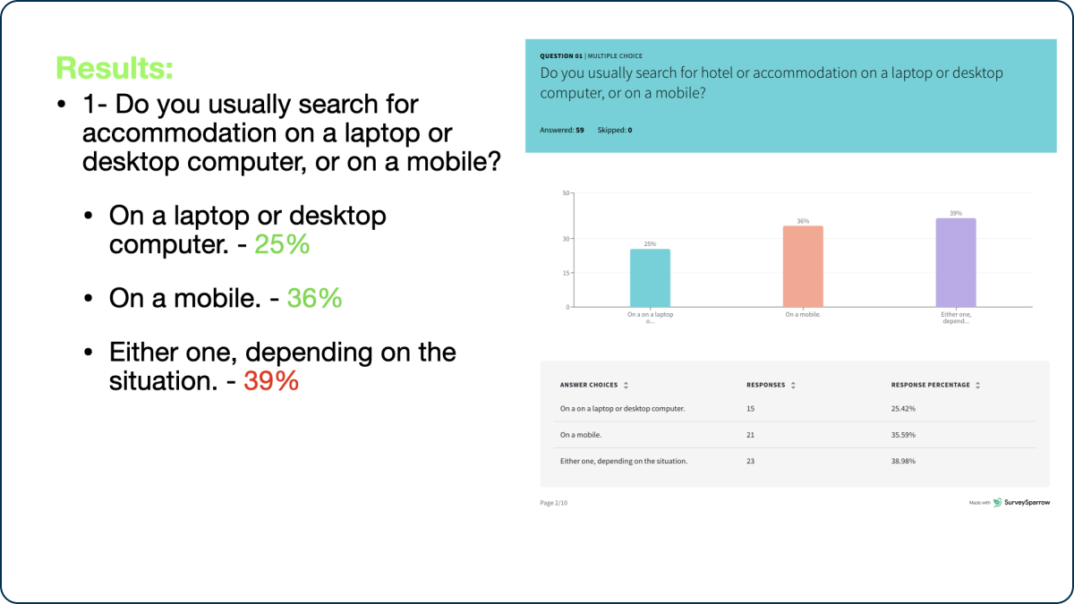
  • 36% of participants search for accommodation on their mobile phones, and almost half of those users use a dedicated app instead of the browser.
  • “Some apps shows you which day it's better to book (they show you the whole month with different prices for every day) and I find it very convenient for people like me, who are quite flexible”.

Take a look at the finished document with the finished results of the survey.

User Interview and Usability Test

For this project UX Design Institute provided us with videos of 2 interviews and usability test of hotel mobile apps.

The objective was to watch the videos and take notes with useful insights from them.

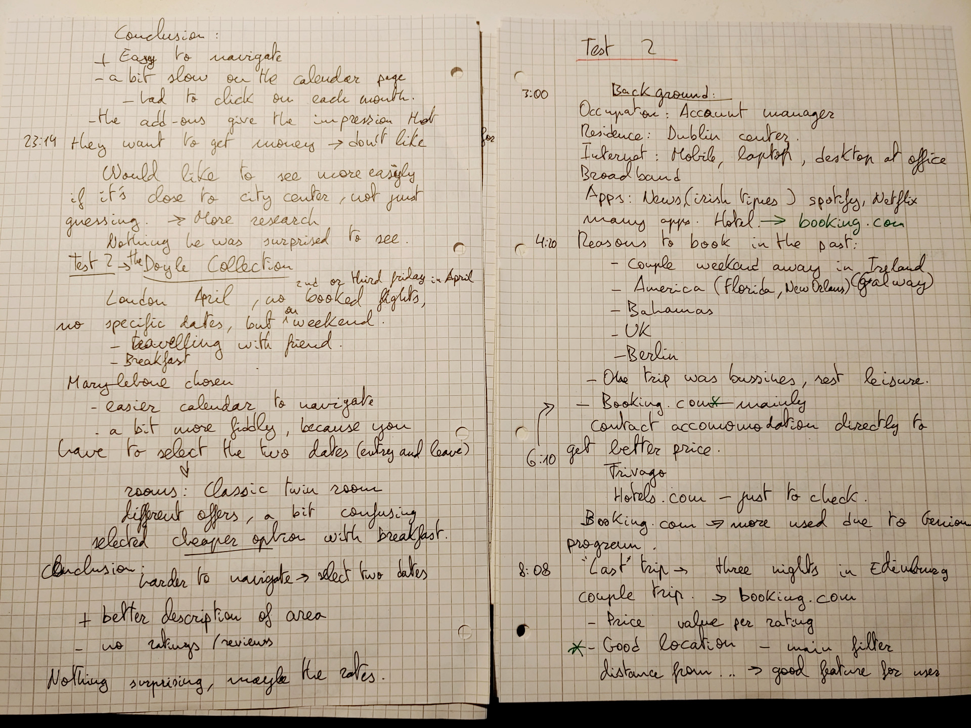
Notes from the usability tests videos
Hand-written notes from the usability test videos

The next step was to conduct my own interviews and usability tests to gain experience in this area.

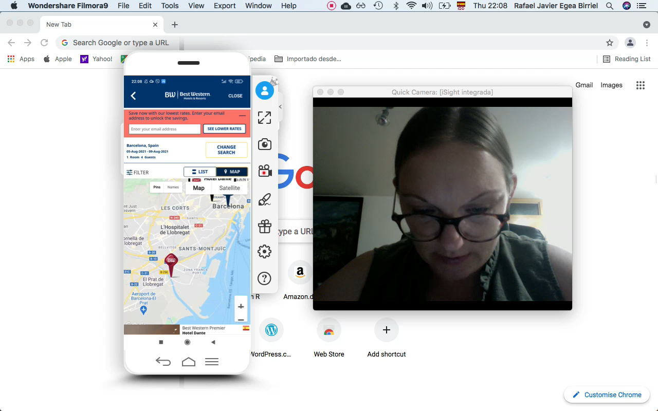
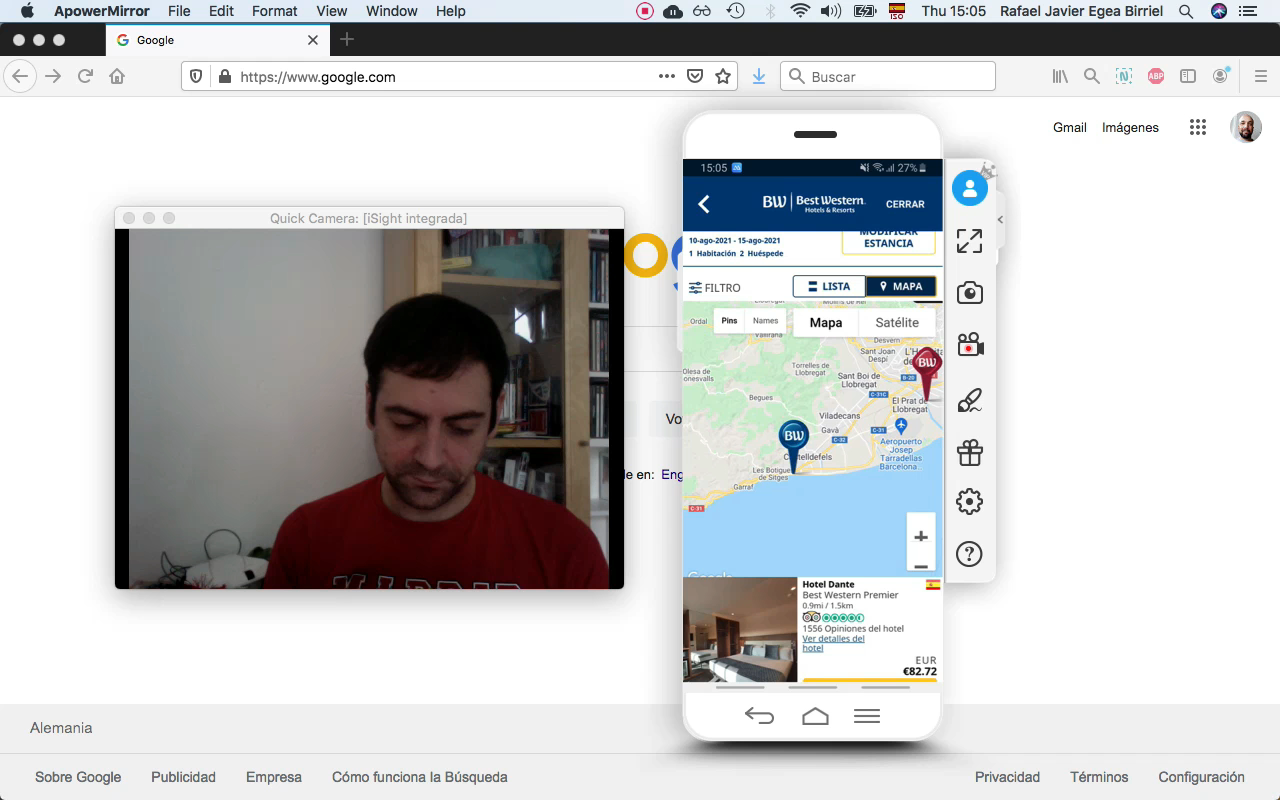
I decided to carry out the tests in person so it would be easier to interact with the participants. First I I had to figure out the technical setup to record the sessions: I used ApowerMirror to mirror the screen of the mobile onto my laptop's screen and Filmora to record the sessions. I then found 2 participants and recorded their interviews and usability tests.

Usability test number 1
Usability test #1
Usability test number 2
Usability test #2

There were some interesting findings at this stage:

  • Users are used to select dates on one calendar with 2 taps of the finger, instead of selecting them on 2 different calendars.
  • Users like to see the location of the hotels easily.
  • The hotel information, features and extras should be clear in order to help users make a decision.

Analysis phase

After collecting all this data, it was time to make it more “digestible”, analyzing and organizing it so we could figure out exactly the problems that we should tackle on the next steps. On this phase I carried out 2 projects: an Affinity Diagram and a Customer Journey Map.

Affinity Diagram

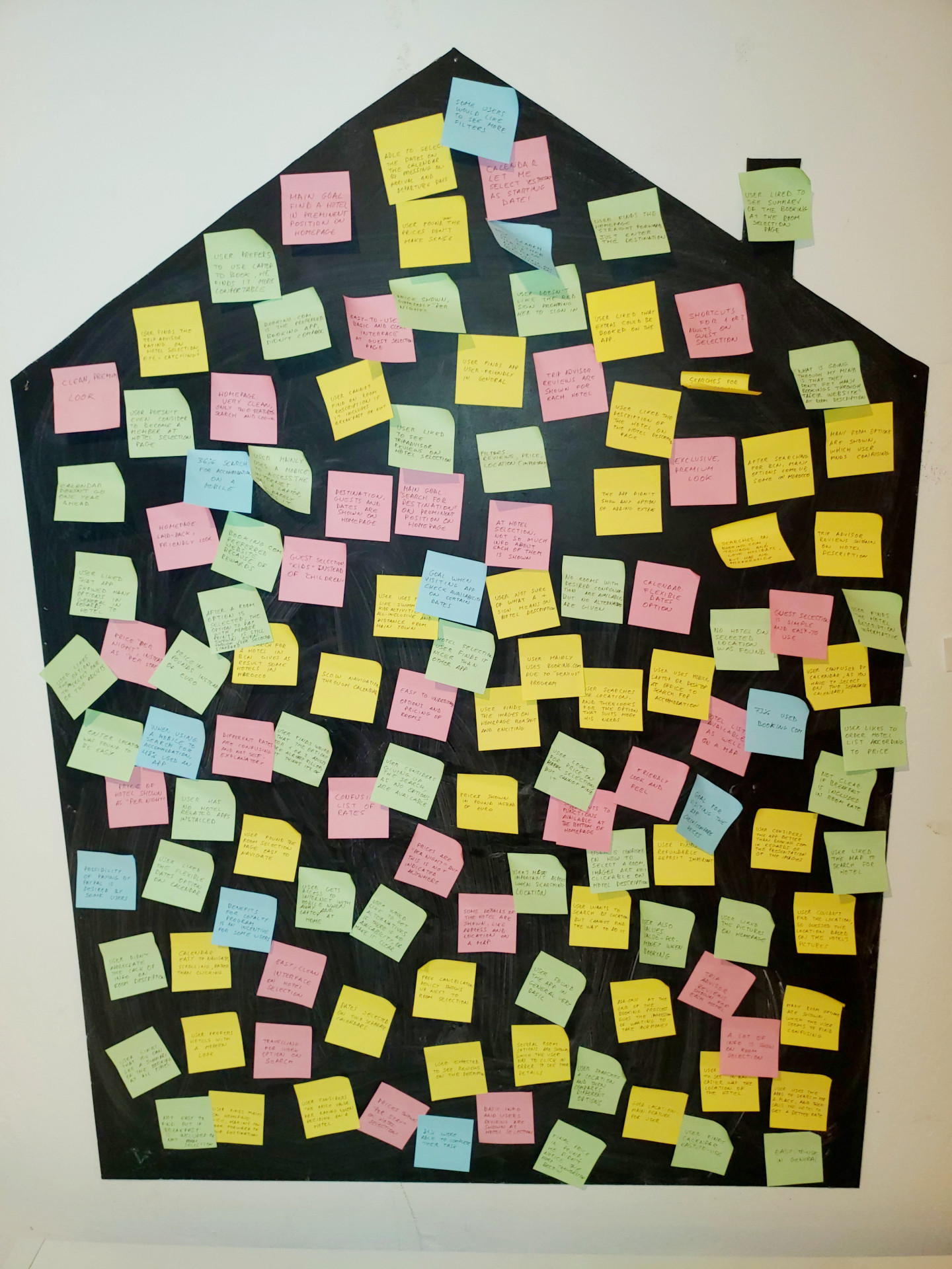
After reviewing all the research data, I began writing the notes, using different colours for the different sources of data, and, with the help of my girlfriend, Petra, we stuck them on a blackboard.

Different colors of notes were used for different sources of data:

Competitive Benchmark

Online Survey

Note Taking

Usability Test

Unorganized post-it notes

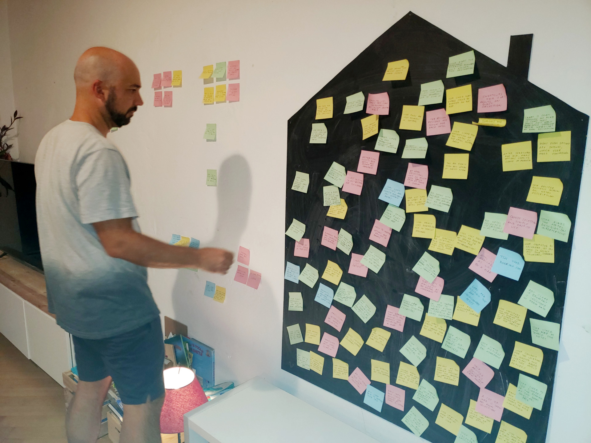
We organised these notes into groups together, to achieve a certain level of collaborative analysis, and, after a while, the whole living room wall was full of them.

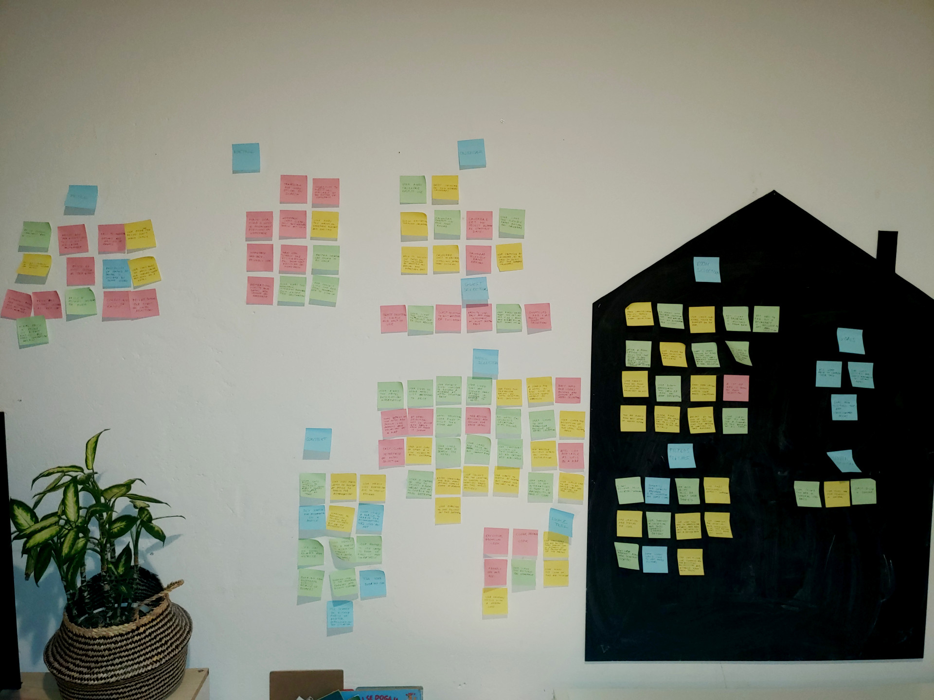
Some of the bigger groups were later divided into smaller groups, in order to make them more specific.

Rafael organizing the notes
rganized post-it notes

Some of the groups were named after the different steps of the user flow, like Homepage, Calendar, Hotel Selection, etc... One group dedicated to the the context in which the users search for accommodation, with both qualitative and quantitative data.

Other groups were formed only by qualitative data, like how does the app look and feel, or general opinion.

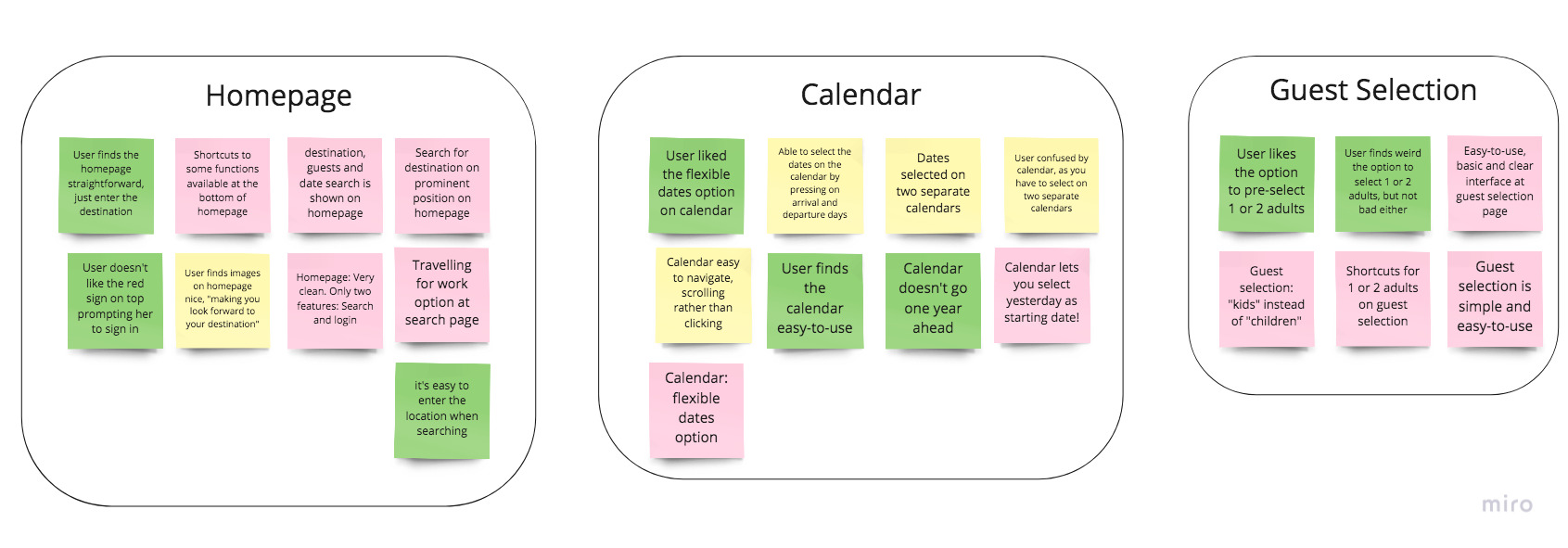
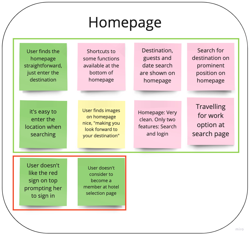
Affinity diagram

I then typed again every note in Miro , so I could show the notes in a neater way, and then recreated the groups that we had on the wall.

Inside the groups a distinction was made between good UX and pain points, to identify which practice should continue, and what could be improved in the future.

To see the finished document press here .

Customer Journey Map

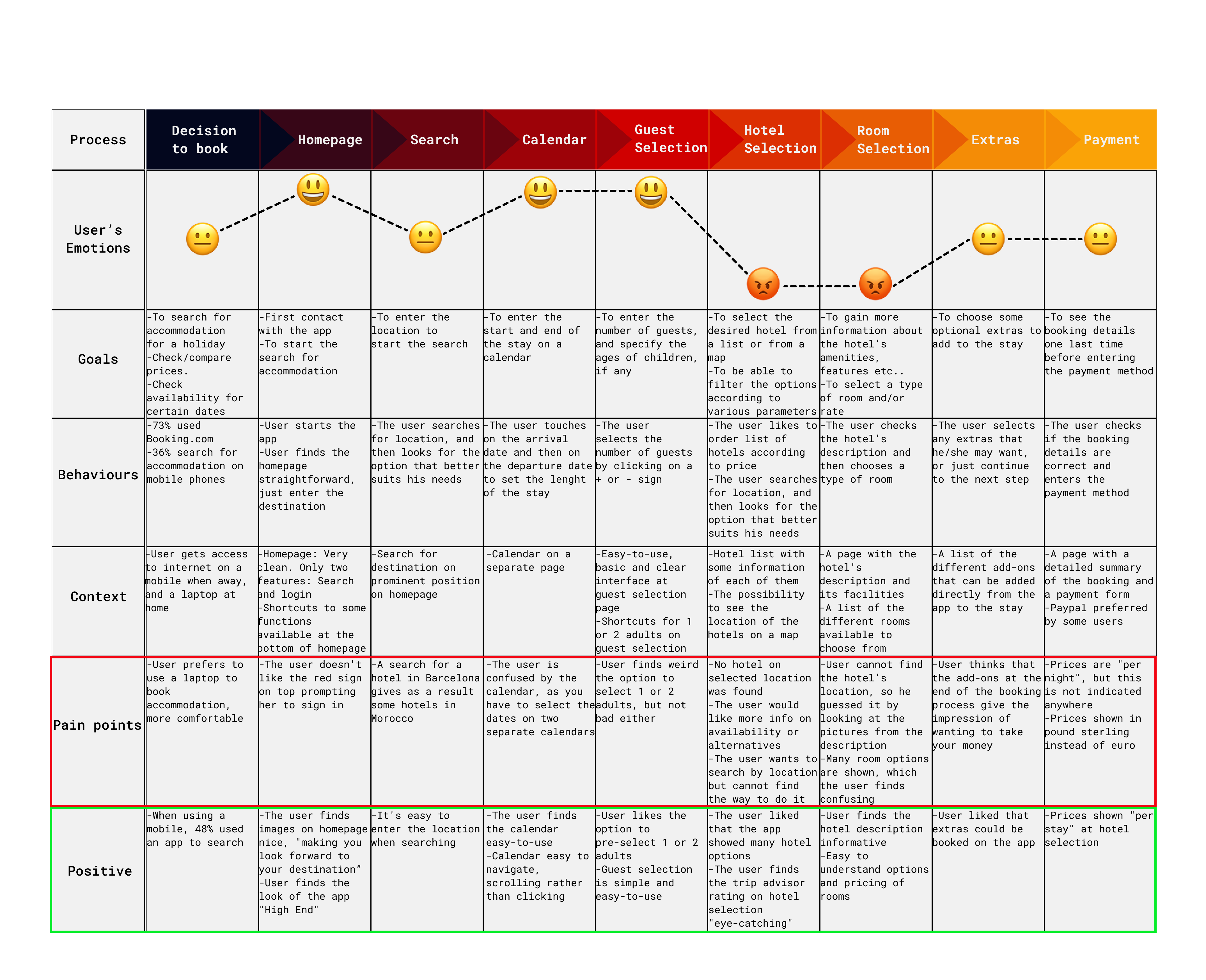
The objective of this project was to put even more analysis structure to the research data. The different sections were taken from the groups that we created on the affinity diagram. The data was then divided into Goals, Behaviours, Context, Pain Points and Positive. A row was used to show the user's emotions with emojis, to show if the different steps were positive, negative or neutral.

Customer Journey Map

To see the the map in more detail press here.

Analisis conclusion:

After the analysis phase, the main problems that had to be solved were clear:

  • Users shouldn't be pushed to register onto a customer program.
  • Dates should be salected by tapping on only one calendar.
  • The selected destinations should be clear, and if no hotels are available in one destination, it should be stated straight away.
  • Location of the hotel should be easy to find.
  • Costs should be clear and stated in the user's local currency.

Design phase

At this point I began to use the ideas found in the analysis phase to start designing the new app. I started by figuring out a User Flow Diagram, then I went on to sketching and prototyping the app. The final step was to create the wireframes with all the information needed to develop the actual app.

User Flow Diagram

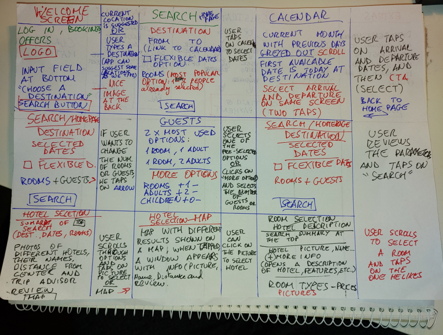
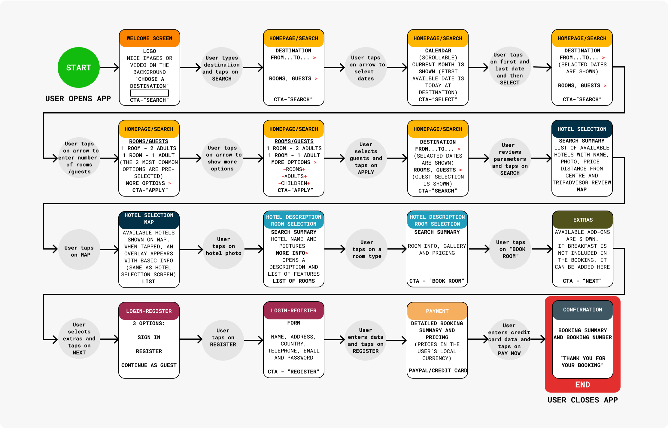
The objective of creating the Flow Diagram was to define the high-level booking flow for your mobile app, as well as to start addressing all the issues highlighted in the analysis phase. First, I sketched the flow on a piece of paper, when I was satisfied with the result, I recreated the flow in digital format using Figma.

User Flow Sketch
User Flow Diagram

Each screen (or screen state) is represented by a rectangle, the circles represent the user's interaction. To see the whole document press here.

Interaction Design

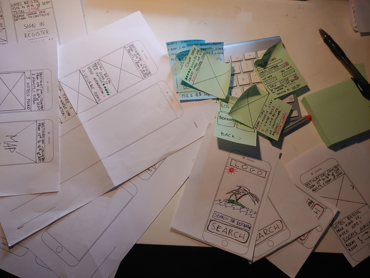
The next step was to build on the Flow Diagram and sketch the screens and screens states that will be later reproduced on the prototype, adressing the issues and user goals identified in the research and analysis phases. I used some mobile phone templates to start sketching on them, using post-it notes to represent floating buttons or overlays that appear at some stage of the proccess.

Working on the sketches

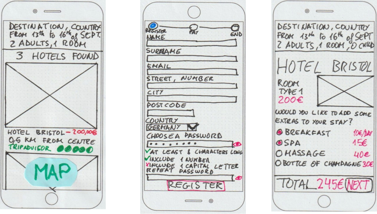
During the skeetching process, I encountered some problems, made mistakes, or I simply had new ideas, so in the end I had different versions of the same screen to choose from. After all the sketches of all the different screens were ready, I scanned them in order to create a detailed document with explantions of all the details on Figma.

Group of sketches of Hotel selection screen, room extras and registration form

You can check out the whole document clicking here.

Prototype

Now it was time to transform the sketches into a working medium-fidelity prototype. I used Figma to create my prototype because it was the tool that I had mainly been using throughout the course. In the beginning it was difficult to create the screens and interactions for the first time, and it was taking longer than I expected, but when I got the hang of the tool's prototyping workflow, it all went much smoother.

Group of sketches of Hotel selection screen, room extras and registration form

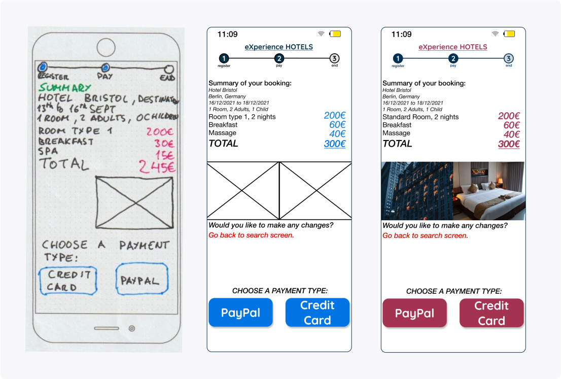
Different stages of the project: from sketch to prototype.

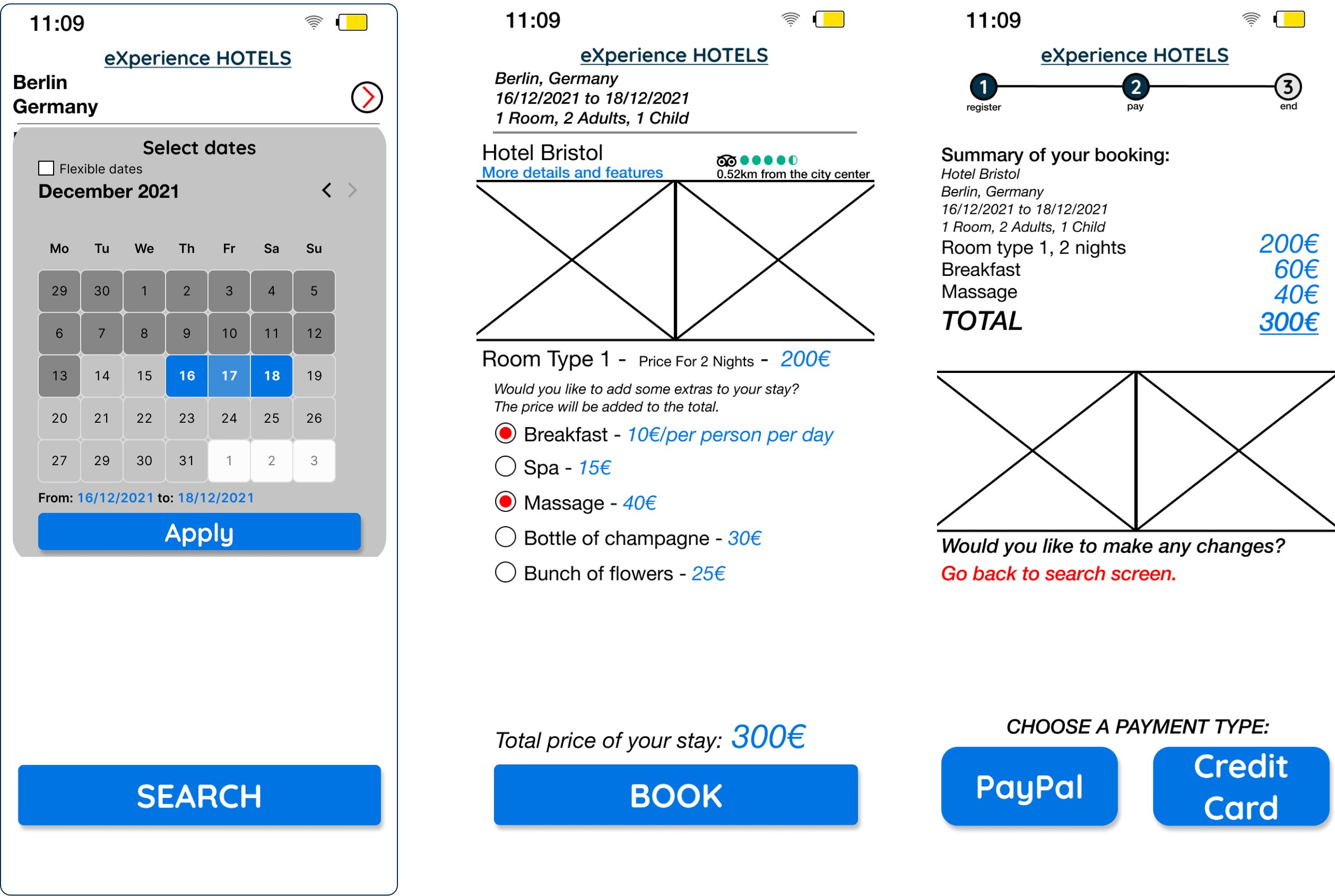
I created a medium-fidelity protype without real text or images, but with the same structure and features that I planed on the flow diagram and the sketches.

Screens of medium fidelity prototype: calendar, room extras and payment screen

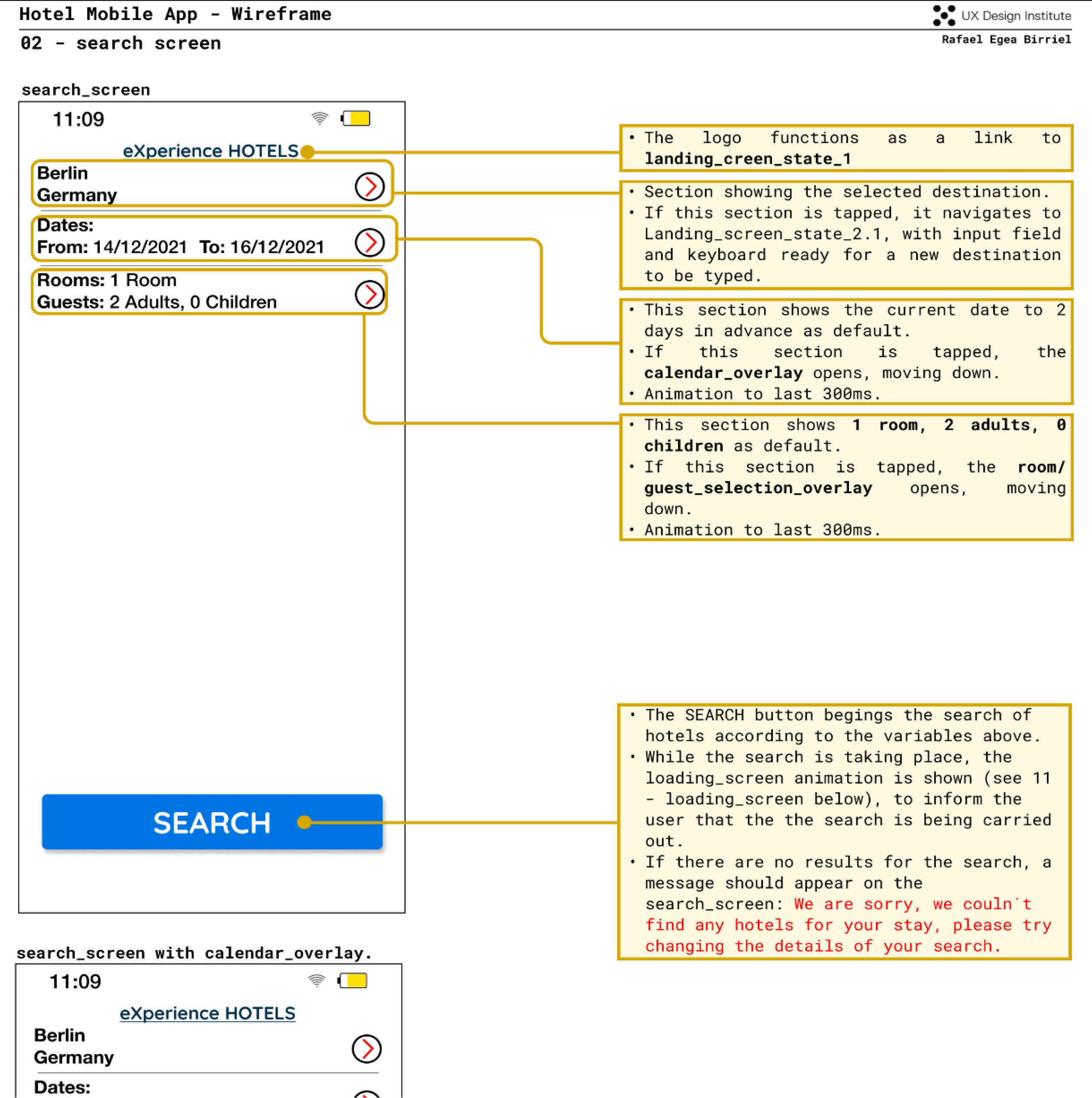
The last project of the course was to create detailed wireframes with all the details that developers require to create the actual app.

Wireframes of search screen

To see the whole document press here

High-fidelity Prototype

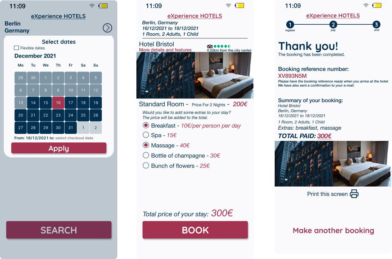
After I got my feedback for my prototype and wireframes from UXDI, I decided to go one step forward and make the prototype more real, adding pictures and text to turn it into a high-fidelity prototype. I also tried to create a nicer UI by changing the colour palette to have a consistent, more apealing interface.

Take a look at the finished prototype.

Screens of high-fidelity prototype: calendar, room extras and payment screen

Check out the prototype here

Validation phase

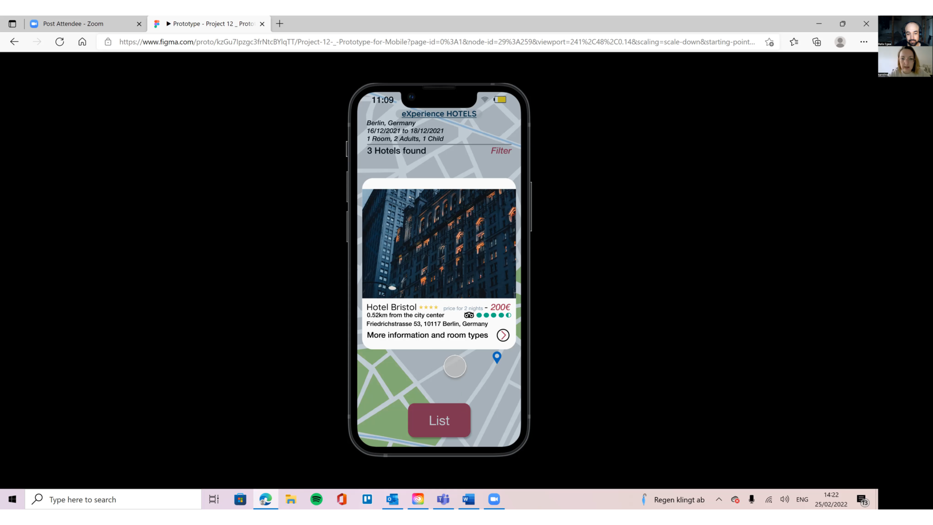
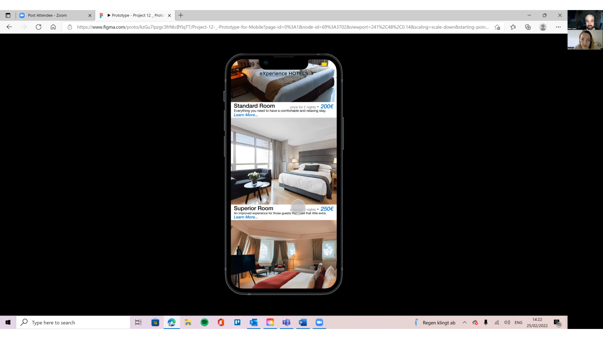
To wrap up my case study, I decided to validate my design by testing it. I asked a friend to test the prototype, to get an idea of what a real life user would think about it. I decided to conduct this usability test remotely, because I think it's going to be more and more common to interview and conduct usability tests this way. I wanted to understand the details and get used to this kind of setup.

Validation screenshot

I used Zoom in order to connect to my user. First I carried out an user interview to get to know more details about her experience with hotel search apps and the context in which she usually uses them.

We then went on to test the prototype by the screen sharing feature in Zoom and the prototype presentation in Figma. I explained the task that I wanted her to carry out, a booking that showed the flow that a normal user would go through when booking a hotel through their mobile phones. I tried to make very clear to her that it was still a prototype, so not all functions and buttons would work.

Findings:

Conclusion

This was my first ever UX design project, and it was quite a journey. I learned a lot about the UX process, from the moment that I carried out the first projects in the research phase to creating a working prototype and testing it. I understood the importance of following the process in order to make UX Design happen.

Overall it was a great experience. There were some challenging moments, but I learned a lot of different skills from it and I really enjoyed some parts of the process, like analyzing and organizing the raw research data using an affinity diagram.